

Brush Lettering for Beginners: Strokes + Practice Checklist

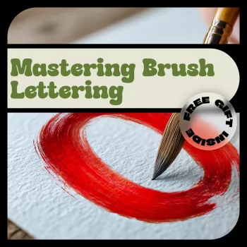
Mastering Brush Lettering: A Beginner’s Guide to Modern Brush Calligraphy With a Simple Practice Checklist
Brush lettering can look intimidating, but the fundamentals are learnable with a few core strokes, the right pressure control, and a repeatable practice routine. This guide breaks down essential tools, warm-ups, letter-building, and a practical checklist so beginners can build clean, modern letterforms without guesswork. For more guidance, see Brush Lettering: The Complete Guide for Beginners.
What Brush Lettering Is (and What It Isn’t)
Brush lettering is all about contrast: light pressure creates thin upstrokes, and firmer pressure creates thick downstrokes. That thick-and-thin rhythm is the “magic” that makes modern brush calligraphy look polished even in simple styles. For further reading, see Brush Pen Lettering For Beginners (Free Alphabet ….
It’s also different from pointed-pen calligraphy. A flexible nib spreads with pressure in a precise way, while a brush pen behaves more like painting—your movement is smoother, more sweeping, and more sensitive to paper texture and speed. Modern brush calligraphy tends to reward consistency (contrast, spacing, smooth joins, and steady slant) more than ornate flourishes early on.
For fast progress, avoid trying to memorize full alphabets on day one. Clean strokes and reliable spacing create better letterforms than rushing through A–Z.
Tools That Make Learning Easier
Beginner-friendly tools reduce friction—literally. A small brush pen or flexible felt tip gives you more control in tight curves and makes it easier to keep downstrokes smooth. Pair it with smooth paper, because rough fibers can fray tips quickly and turn thin lines fuzzy.
If you prefer digital practice, a tablet and pressure-sensitive brush can mimic real pressure changes while letting you repeat drills endlessly. The key is choosing a brush that clearly tapers on light pressure and thickens predictably when you press.
Keep a scrap sheet nearby for quick ink-flow checks and a 30-second warm-up before you start your real practice page.
Quick tool checklist for beginners
| Item | Why it helps | Beginner note |
|---|---|---|
| Small brush pen | Easier control for tight curves and smaller letters | Start small before moving to larger brush tips |
| Smooth practice paper | Prevents tip damage and improves line quality | Avoid very fibrous notebook paper |
| Guidelines (printable or ruled) | Helps keep slant, height, and spacing consistent | Use light pencil or a guideline sheet underneath |
| Tablet + pressure brush (optional) | Allows repeat practice without wasting paper | Choose a brush that responds clearly to pressure changes |
The Core Rule: Pressure Control
Pressure control is the one skill that makes everything else easier. On upstrokes, use feather-light pressure—think “glide, don’t press.” On downstrokes, add firm, steady pressure to build a consistent thick line.
Moderate speed helps. Too slow often causes wobble because your hand over-corrects. Too fast can make your curves collapse or your downstrokes uneven. Aim for a steady tempo and prioritize uniform thick-and-thin contrast over dramatic width.
Your hold matters, too: keep your grip relaxed and let your forearm guide the motion. When finger movements dominate, lines tend to look shaky and cramped.
Warm-Ups: The 5 Strokes That Build Most Letters
Warm up for 3–5 minutes before lettering. It’s the fastest way to reduce stiffness and train muscle memory for smooth transitions.
Stroke-to-letter map
| Stroke practice | Common letters it supports | What to watch for |
|---|---|---|
| Downstroke drills | l, t, k, h | Even thickness and straightness |
| Underturns | i, u, y, j | Clean bottom curve without flattening |
| Overturns | n, m, h, r | Consistent tops; avoid pointy humps |
| Ovals | a, o, d, g, q | Balanced shape; smooth thick-to-thin transitions |
| Compound curves | m, n, v, w | Rhythm and spacing between humps |
Building a Clean Alphabet Without Overwhelm
Spacing, Bounce, and Basic Composition
A Practice Checklist That Actually Builds Skill
If you want a structured, ready-to-print routine, Mastering Brush Lettering – Beginner Brush Calligraphy Guide, Digital eBook & Practice Checklist for Modern Hand Lettering Skills organizes drills and checklists so practice stays consistent. For simple habit tracking (especially if you like checking boxes), a separate planner-style download like The Uni Budget Boss Checklist | Digital Download | How to Budget at Uni Like a Pro | Student Money Planner can double as a daily “did I practice?” log.
Common Beginner Mistakes (and Quick Fixes)
A Ready-to-Use Beginner Guide and Printable Checklist
Structured practice helps most when progress feels random. A checklist format keeps sessions focused, prevents skipping fundamentals, and makes it easy to spot what’s improving week to week. Digital access is also convenient for reprinting practice pages or pairing them with a tablet workflow. For additional context on the broader calligraphy tradition, reference resources like Encyclopaedia Britannica: Calligraphy and the education materials at IAMPETH. If you practice on iPad, the Procreate Handbook is a helpful guide for pressure and brush settings.
FAQ
How long does it take to get good at brush lettering?
With 10–20 minutes most days, many beginners notice smoother strokes and better spacing in 2–4 weeks, then clearer word-level consistency around 6–8 weeks. The first wins are usually steadier downstrokes and cleaner joins, not fancy flourishes.
What’s the best brush pen for beginners?
A small brush tip or flexible felt tip is usually easiest to control because it handles tight curves without forcing heavy pressure. Pair it with smooth paper to protect the tip; if you practice digitally, choose a brush with clear pressure response and predictable taper.
Why do my thick downstrokes look shaky or uneven?
Shaky downstrokes typically come from pressing too hard, moving too slowly, or drawing mostly with the fingers instead of the arm. Relax your grip, use a moderate speed, and drill 10–15 steady downstrokes after a quick warm-up to stabilize thickness and edges.










Leave a comment